Why, Ms. Krentz? Why?
Mar 16
2006
I decided it was time to do another post on great covers by wordcandy authors. You know-- keeping it positive, recognizing authors who actually care how the outside of their books look.... But then I did a search on Jayne Ann Krentz, and before I knew it, this post had practically written itself.
We'll have to start with a little history lesson on Ms. Krentz's past covers. As you can see, over time they have become better designed and more interesting. Never truly great covers, but nothing you would be embarrassed to be caught reading in a public place, either:

Her more recent covers are actually sexy! They confidently announce: "I am about sex, you know you want to read me". They actually remind me a bit of Laurell K. Hamilton's style of covers, which I always think look fine (except for the dread Micah cover). Still not spectacular, but a vast improvement:

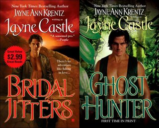
So imagine my surprise when I pulled up these covers. I realize this is a pen name so they need to look a little different, but there is no excuse for these-- the difference between the words and the visuals just look absurd. I mean, really, does the guy with his little leather vest in the jungle really look like a ghost hunter?

Yeah, I think not.
We'll have to start with a little history lesson on Ms. Krentz's past covers. As you can see, over time they have become better designed and more interesting. Never truly great covers, but nothing you would be embarrassed to be caught reading in a public place, either:

Her more recent covers are actually sexy! They confidently announce: "I am about sex, you know you want to read me". They actually remind me a bit of Laurell K. Hamilton's style of covers, which I always think look fine (except for the dread Micah cover). Still not spectacular, but a vast improvement:

So imagine my surprise when I pulled up these covers. I realize this is a pen name so they need to look a little different, but there is no excuse for these-- the difference between the words and the visuals just look absurd. I mean, really, does the guy with his little leather vest in the jungle really look like a ghost hunter?

Yeah, I think not.
Posted by: Julianka
No new comments are allowed on this post.
Comments
No comments yet. Be the first!