Once again, we get stuck with the boring cover.
Feb 10
2015
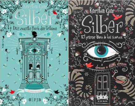
Much to my displeasure (again), I see that Kerstin Gier's Spanish readers are getting both a much faster translation of Silber, the first book in her new trilogy, and infinitely funkier cover art than we do here in the US. (In contrast, you can see the totally generic American/British cover here, too.) Why do American YA publishers insist on making all of their books look alike? Would it kill them to try something different once in a while? Not all teen books have to feature a pretty girl in a pretty dress in a pretty setting, you know?
Posted by: Julianka
No new comments are allowed on this post.
Comments
No comments yet. Be the first!